This is my research for posters of thriller films, this shows what are the codes and conventions for a thriller poster.
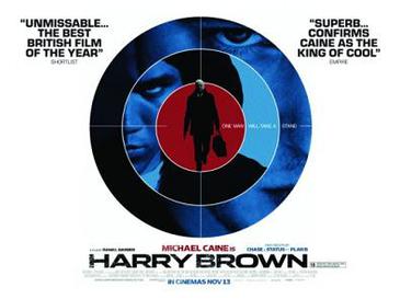 This poster of the Harry Brown film uses three pictures and has very little text apart from reviews and the title. This is quite a simple poster but it gets the audiences attention.
 This poster for Shutter Island is also quite simple it uses a combination of two pictures and has little text. This poster would also catch the audiences attention although it is simple it shows enough through the pictures to capture a persons attention without it being boring.
  This poster for the Black Swan film is again simple, it uses one picture of the main character and has a bit of text informing the audience of the films title, actors in the film and when its being released. The picture is striking which reflects the type of film as it is a pyshcological thriller.
 This poster of the film Frozen uses a dark picture of the setting of the film, there are also two characters in the picture showing a situation in the film. The uses of a dark picture shows the nature of the film. The poster has a small amount of text which includes qoutes from reviews and the title of the film.